If you have a business, you will also need to have a website. In fact, you can start an e-commerce business and use your website to sell your products. It’s a great and lean way for modern businesses to start operating and fits industries from photography to fashion.
When it comes to e-commerce, the website is really the king. It’s important to ensure users find your website, not only appealing but also easy to use. If they don’t, then they won’t spend money on your products no matter how good they are.
So, here’s 10 tips on making your new e-commerce website more user-friendly and to increase your sales.
Tip #1: Coherent branding
It’s important your website is branded. This means having a proper business logo, using recognizable colors, building the site with a single template and using a single font. Why does this matter in terms of usage of the site? It makes it more pleasant and easier to navigate. Customers will start creating brand awareness and associating your business with positive qualities. If one site looks different from the other, site users might feel confused and leave.
Tip #2: Proper search function
You also need to include a search function on each page and make it as comprehensive as possible. You want to include not only the products but any additional information to your search results as well. It is important the customers can modify the search and find the information they are looking for in seconds.

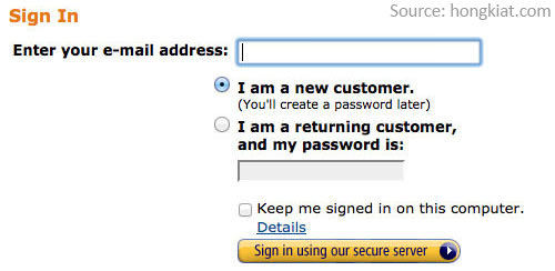
Tip #3: Simply sign-in process
An e-commerce site should definitely encourage users to sign up with the service. This guarantees you are better able to reach out and market your products. However, the signing up process shouldn’t be complicated. Ideally, you want to make it happen simultaneously with the shopping.

Tip #4: Upfront information on payment
Make sure customers are able to see their payment options throughout the shopping process. You don’t want them to get to the last page of the checkout process only to find out they don’t have an accepted card for payments. It’s important to include the symbols of accepted payment options on every page and have a specific page explaining the payment systems and process.
Tip #5: Clear contact information
You also need to ensure the contact information is readily available. It should be at the top or bottom of your page, clearly outlining the different options for getting in touch with your business.
If you can afford it, consider using a live chat feature like Tawk.to. This can help make the user experience better, as the user can talk to a real representative at any time of the process.
Tip #6: Test the loading times
Site users don’t want to spend a lot of time waiting for the website to load. It’s important that each page pops up fast and the whole navigation process is smooth. You need to regularly test your site’s speed and performance. If you’re struggling with the speed, the problem could be in your images (they are not optimised) or your host. Pick your web host carefully and don’t be afraid to change them if the service is not good enough.

Tip #7: Detailed information on shipping and returns
You also need to make sure the site has enough information on the shipping. While it’s definitely worth it to offer free shipping, you need to make sure the possible fees are as clear as possible. If you don’t provide international shipping, this also needs to be clearly stated.
Customers might also want to know about the return options. In fact, you should make the return option readily available on the website – including any tags the user might need to print.
Tip #8: Customer reviews
Do allow customers to leave reviews of your product – even if you obtain the right to moderate them. Customer-generated content is not only good search engine optimisation (SEO) but also great marketing technique. Real user-generated reviews and testimonials give the user a more realistic overview of the product and how it behaves in the real world.
Tip #9: Provide two-factor authentication
Security is a big thing and e-commerce websites must take it seriously. It is crucial to use encryption on your website and clearly communicate this to your users. Aside from using encryption, you might also want to consider two-factor authentication. This can be for signing in or when the user is making a purchase. Different options range from e-mail links to specific phone codes.
Tip #10: Showcase offers and best-selling products
Users will also benefit from the ability to view your current offers and the best-selling products at a glance. These are great for hooking in the user but they also help the user know what you’re about. You definitely want to have the front-page display the hottest products on your e-commerce site together with any offers you’re currently running.
Launching an e-commerce site is not as difficult as it seems. You can use OZCodes.com.au to find a range of web hosts offering special discounts and create a WordPress site with free templates to get started.
Don’t forget to put the above ten tips to good use when launching your user-friendly website.
